

Book Covers
| 30 YEARS Experience |
Book Covers + Graphic Design
Illustration and graphic design complement each other very well.
Illustration and graphic design go hand in hand, and my experience in both allows me to approach book cover creation as a complete, cohesive process. Depending on the project’s scope and budget, I can craft original illustrations, use photo bashing techniques, and handle everything from branding and iconography to typography and layout design.
Below, you’ll find a few examples of projects I’ve worked on—some even expanded into full digital campaigns, including dedicated websites and marketing assets for entire book series.
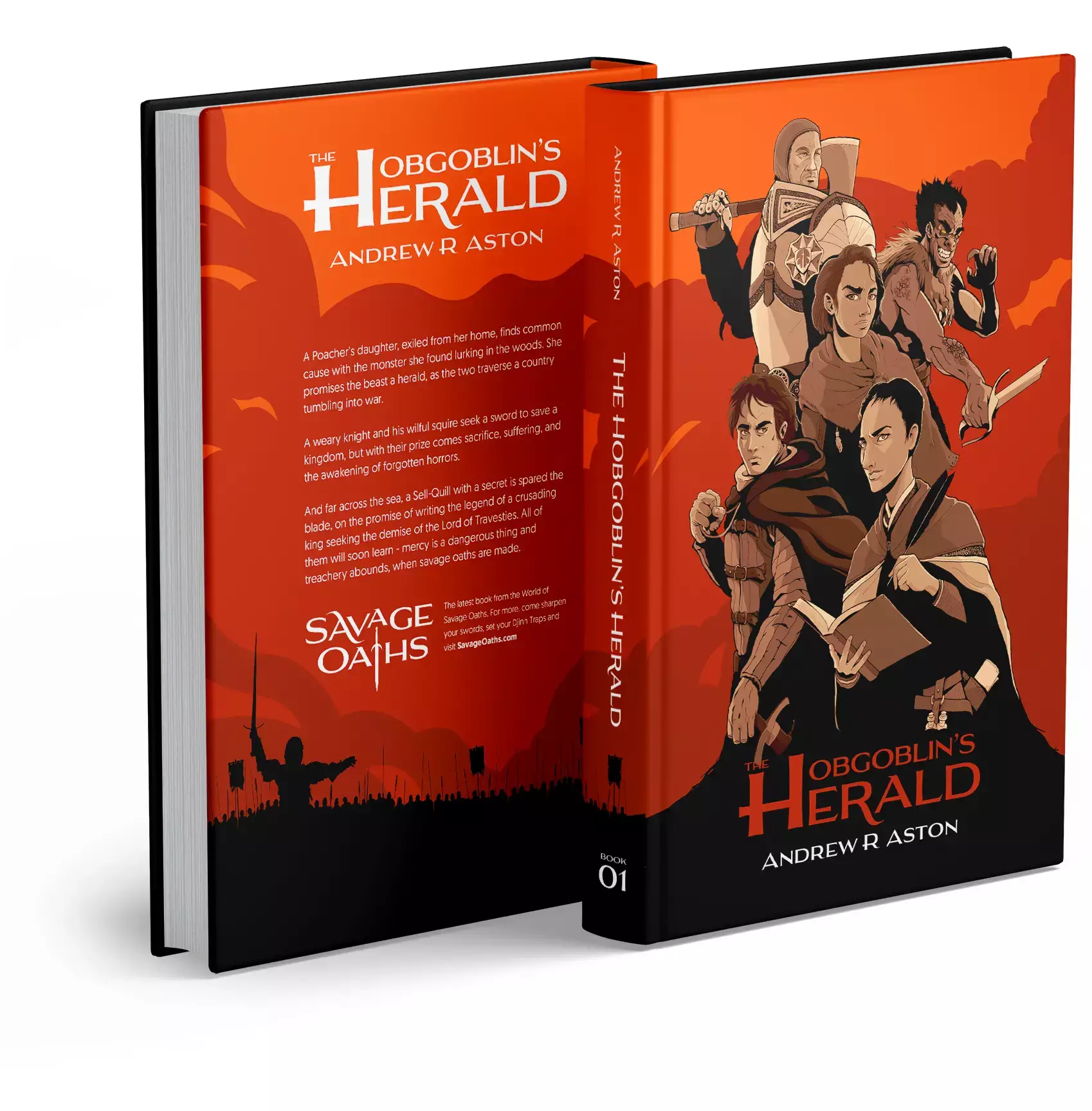
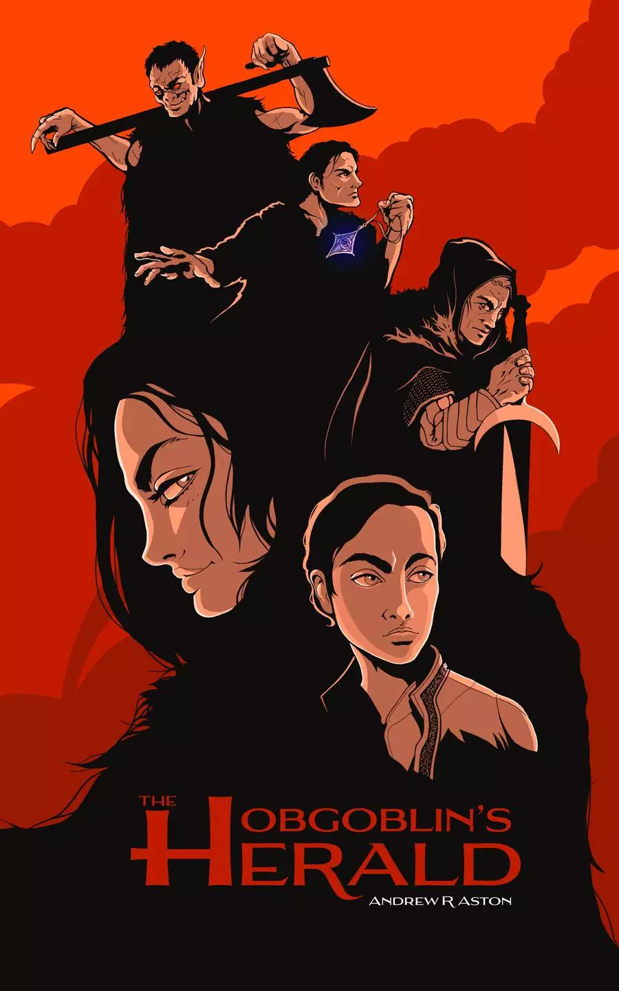
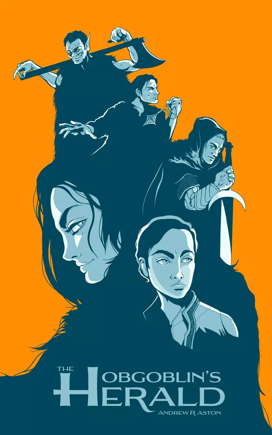
The Hobgoblin's Herald
The Hobgoblin’s Herald is the first book in a fully completed five-part fantasy series by Andrew R Aston, soon to be re-released—and it’s a project I’m deeply involved in.
I’ve contributed far beyond the cover, developing the visual branding and producing a wide range of illustrations, from character portraits to detailed maps.
If you like to see more, please check out the case study for Savage Oaths.
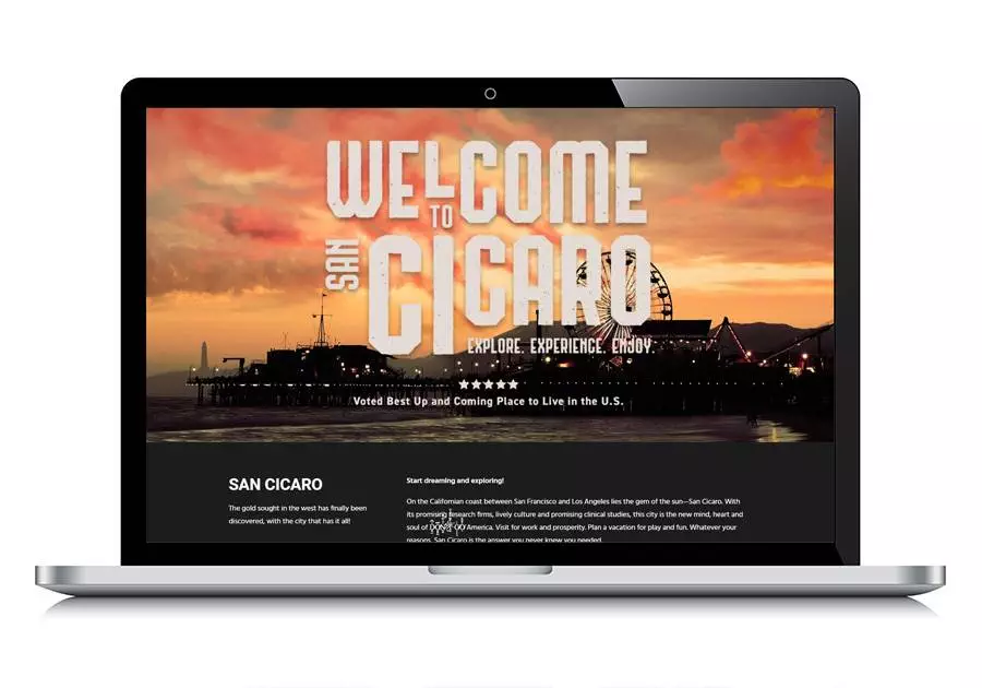
San Cicaro Book Series
This ambitious project from Thunderbird Studios is set in the richly imagined city of San Cicaro—a place so vividly constructed, the editors built their entire marketing around making it feel real.
For the covers, we drew inspiration from vintage travel posters, particularly the art deco style once used to promote glamorous railway destinations. The bold colours and elegant shapes offered a striking contrast to the eerie, often unsettling tales set within San Cicaro—a city where the bizarre and miraculous hide in plain sight.
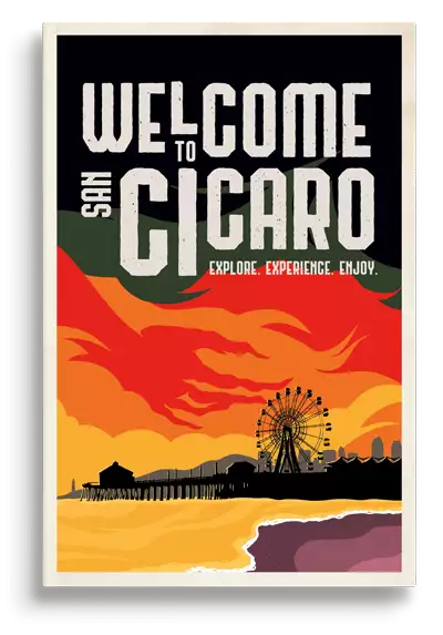
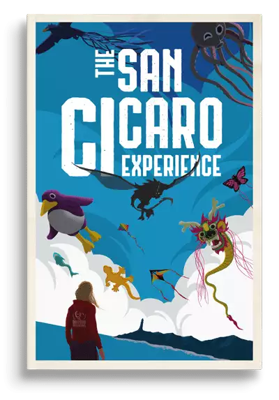
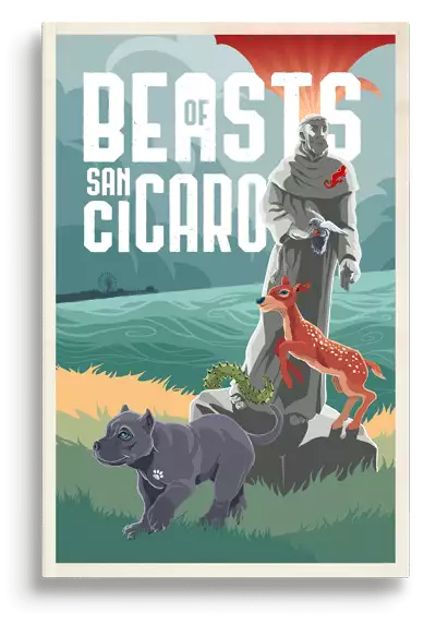
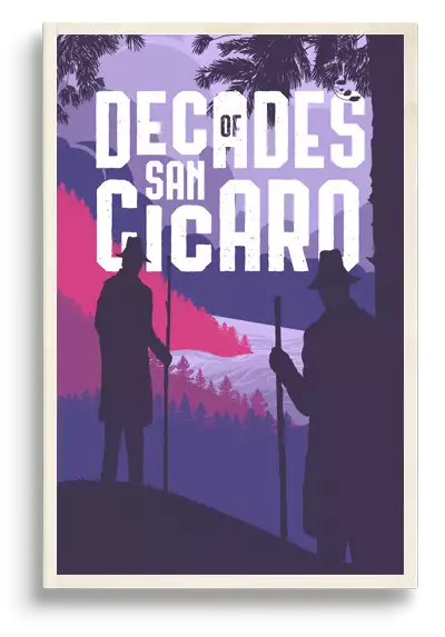
On the golden coast of California lies San Cicaro, a mecca for the misbegotten, a beacon for the strange. Rumors of the bizarre and the miraculous abound, magic baked into the very streets by the scorching sun. There’s wonder and horror aplenty to be found by visitors fearless enough to brave a journey.
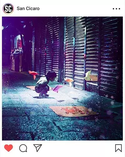
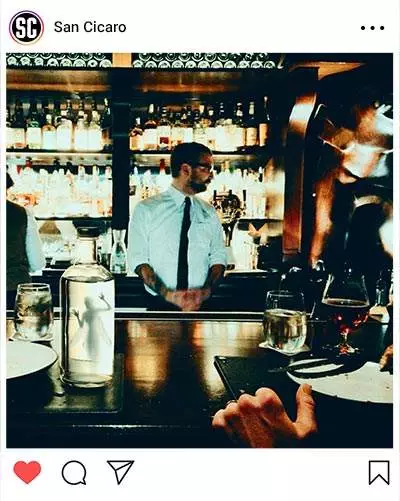
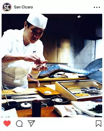
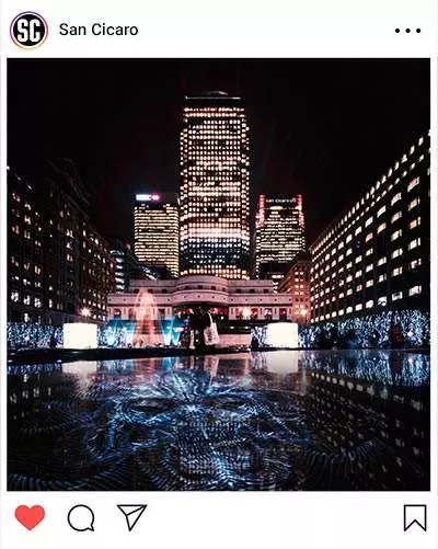
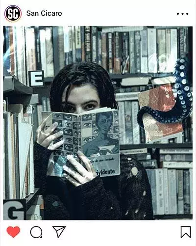
I created the book covers, website, and a promotional postcard, and also handled extensive image editing for their Instagram campaign (samples below). A bit of fun amid the horror—just like San Cicaro itself.
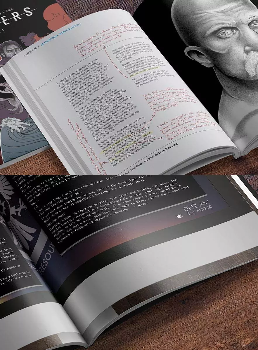
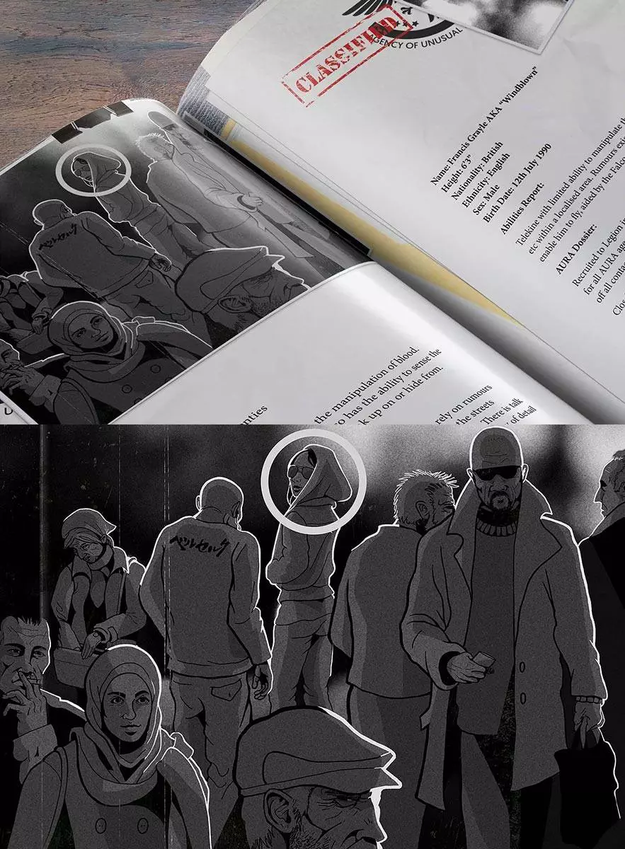
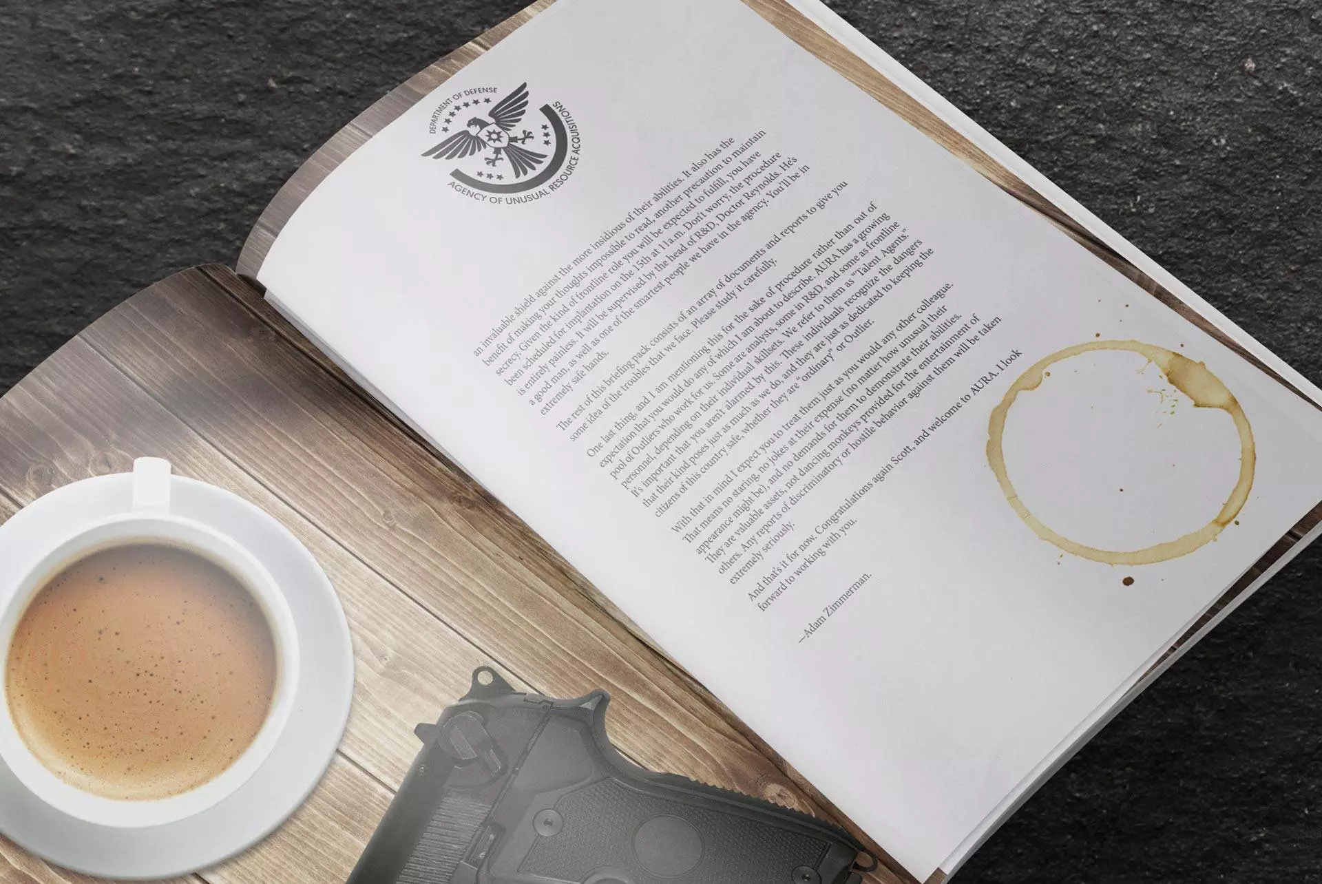
Outliers
I collaborated with five authors on a very creative project called The Outliers Saga—a planned multi-volume series of interlinked novellas and short stories, all set within a shared universe. From the start, I established the visual identity: designing the book layout, crafting all internal illustrations and icons, and creating the cover art and title logo. It was a full-world design approach, aimed at giving the saga a distinct, unified look that would evolve with each new volume.
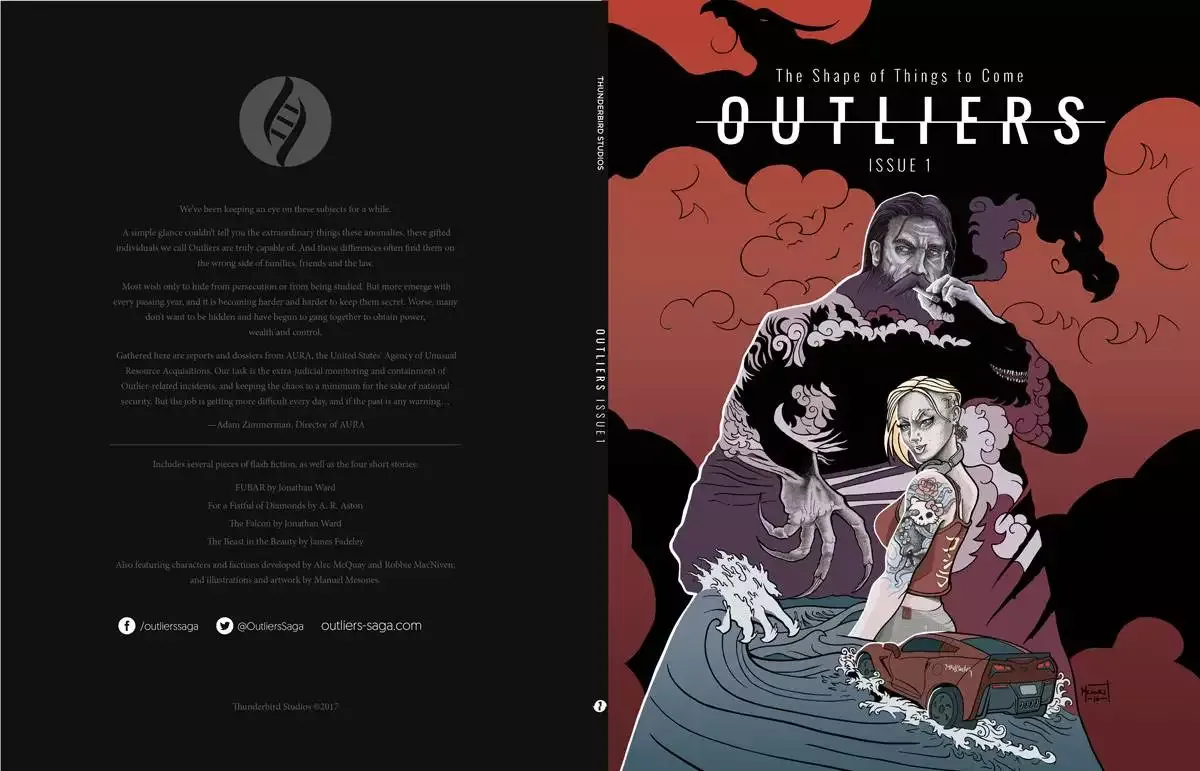
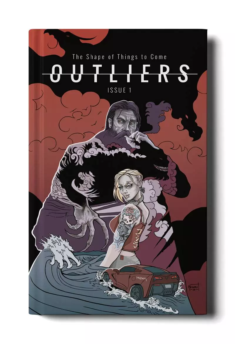
The first issue worked almost like an RPG source-book. It aimed to immerse the reader in the universe.
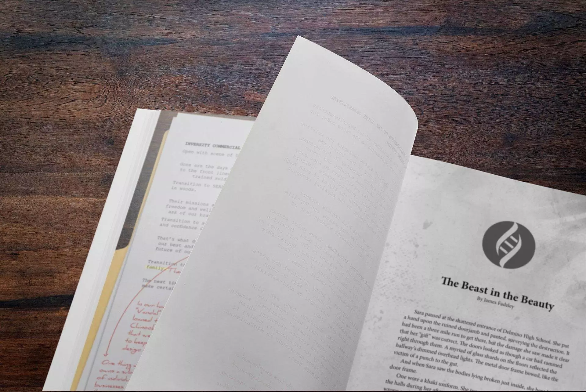

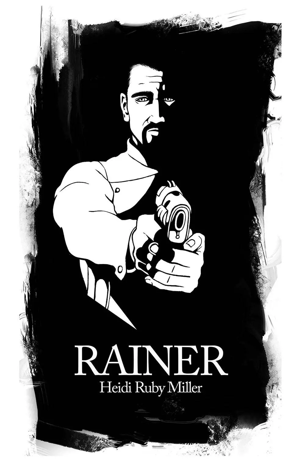
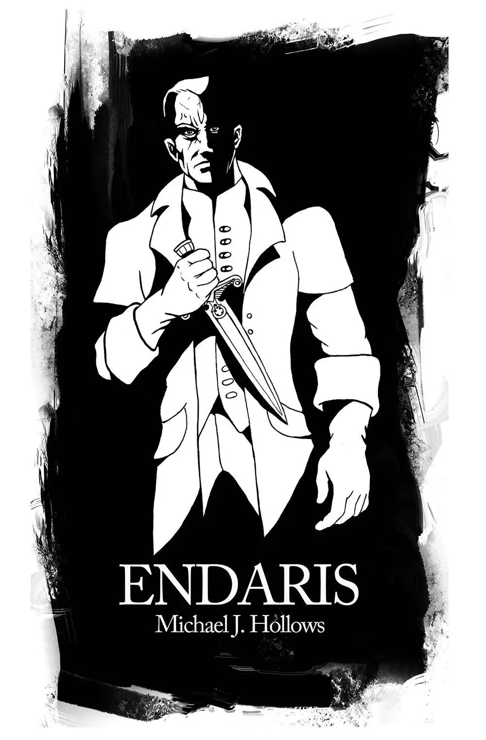
Far Worlds
This was a very interesting job. I was commissioned by a group of authors to create a book cover for their anthology. Also, I was tasked with the creation of a number of interior illustrations, which included a cover for every story within the publication.
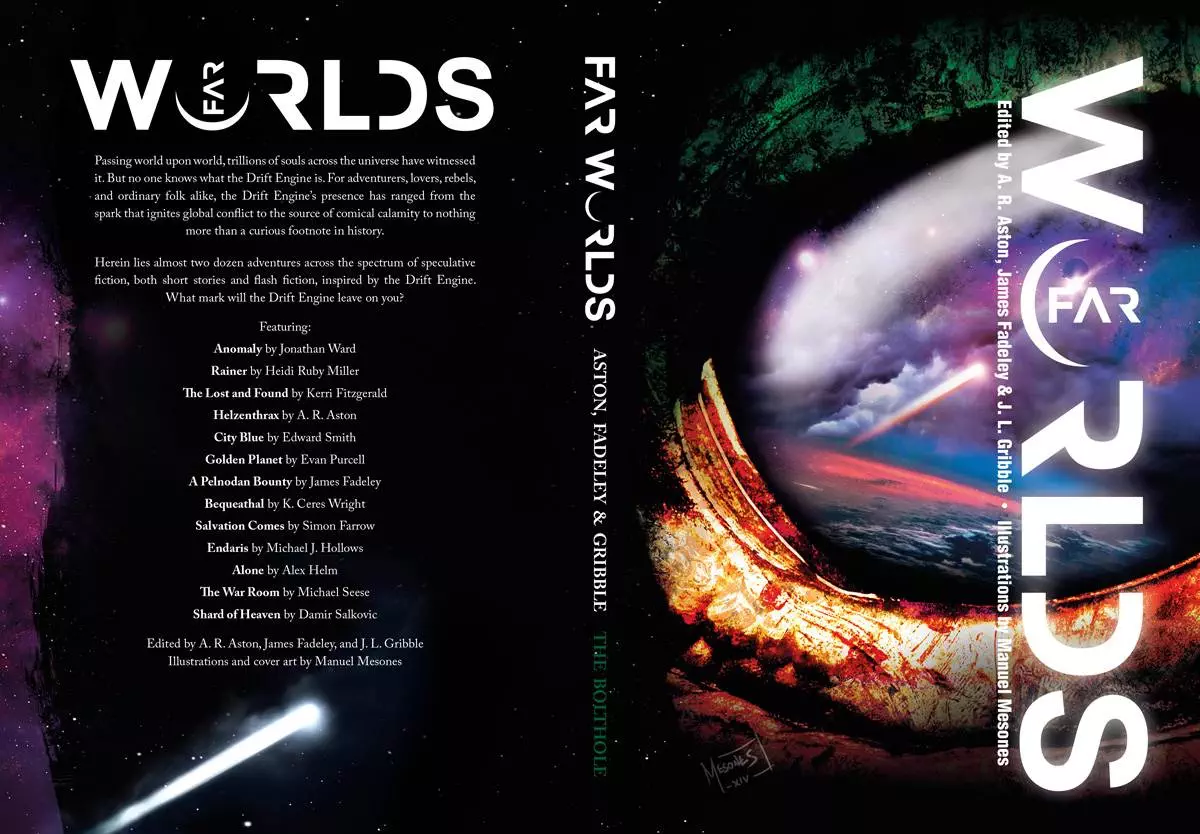
Far Worlds featured speculative fiction stories spanning the spectrum from hard science fiction to epic fantasy to post-apocalyptic horror.
I opted for a very graphic style that would keep the tone throughout the book. Here are some examples.
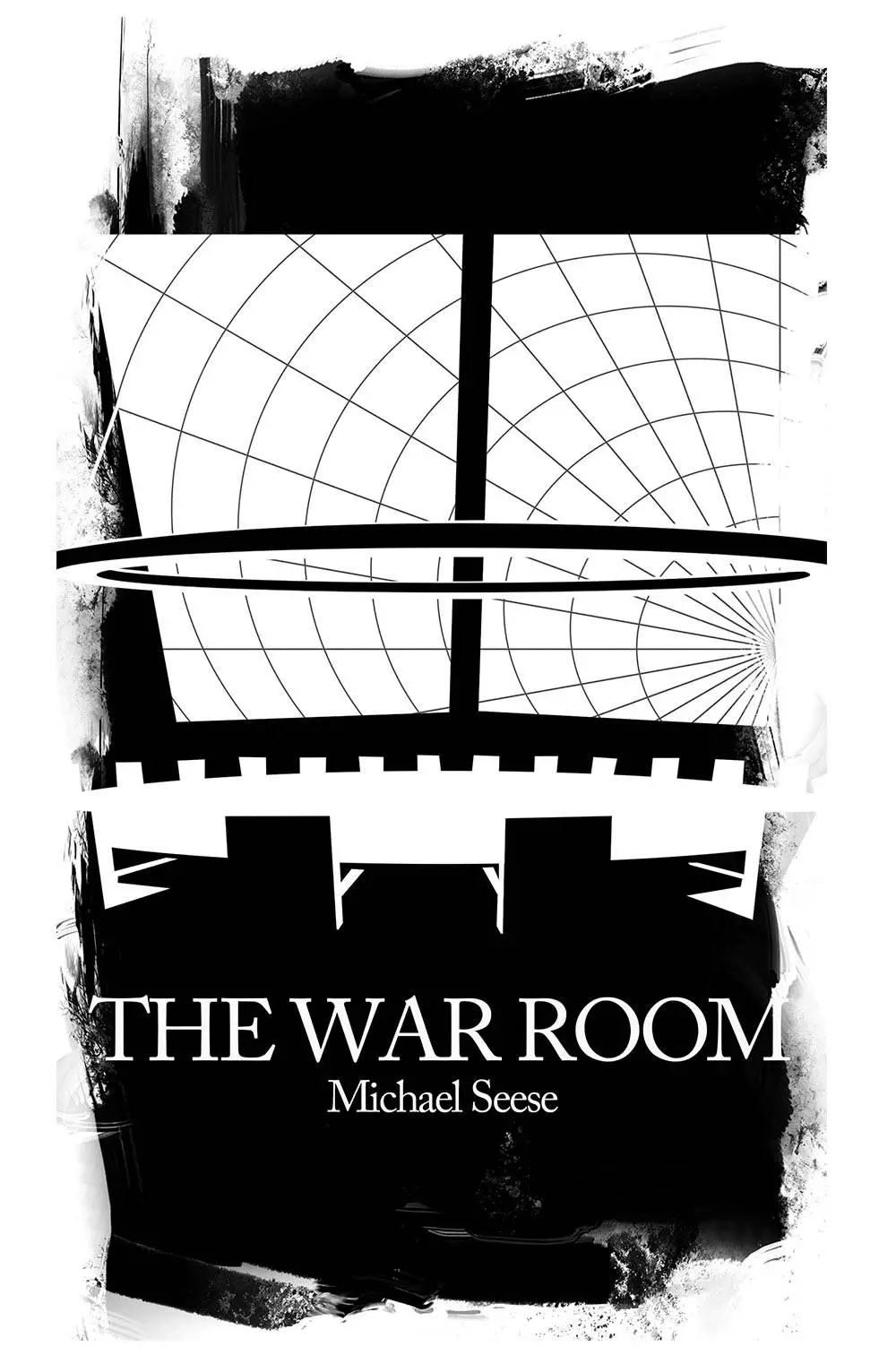
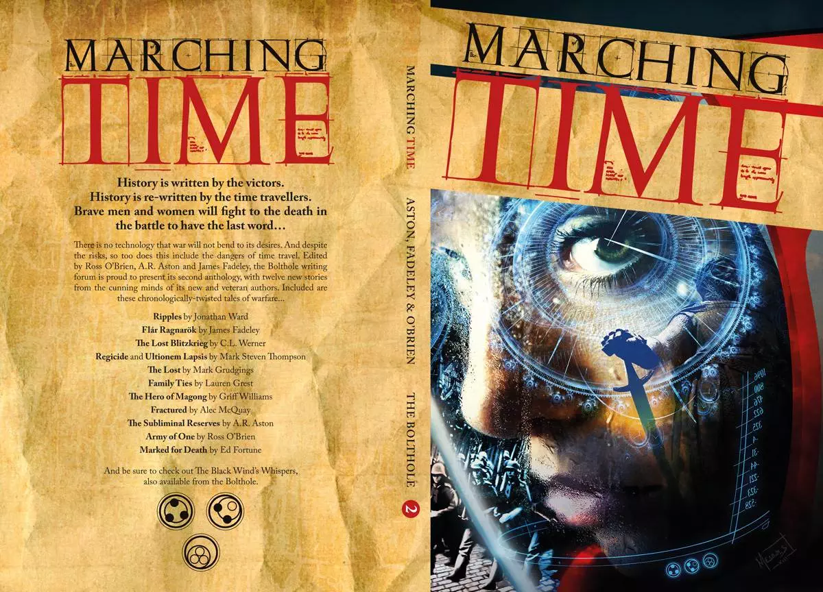
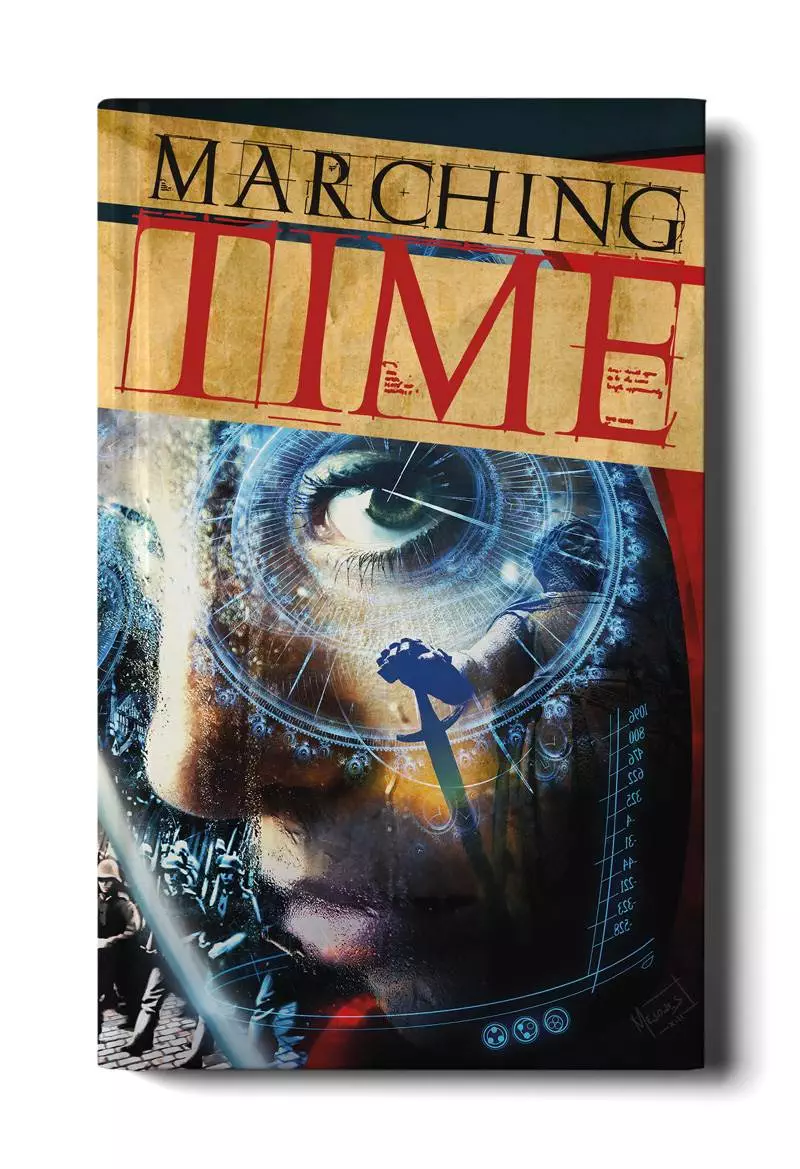
Marching Time
I had a lot of fun working on Marching Time. A group of authors from the Bolthole commissioned me to create a book cover for their 2nd anthology. This was a collection of war stories with a time travel aspect. A page-turner that included a guest story from veteran writer C L Werner.
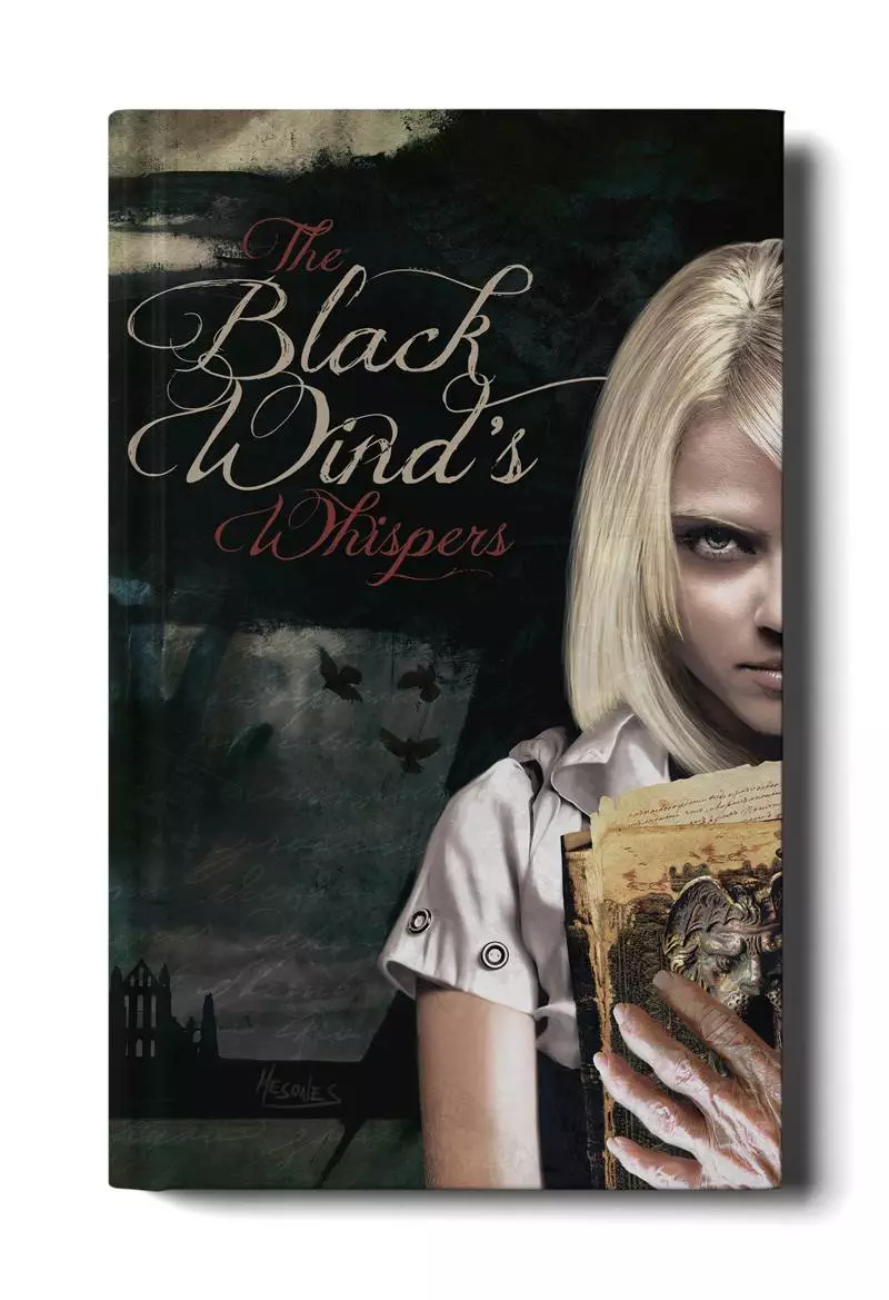
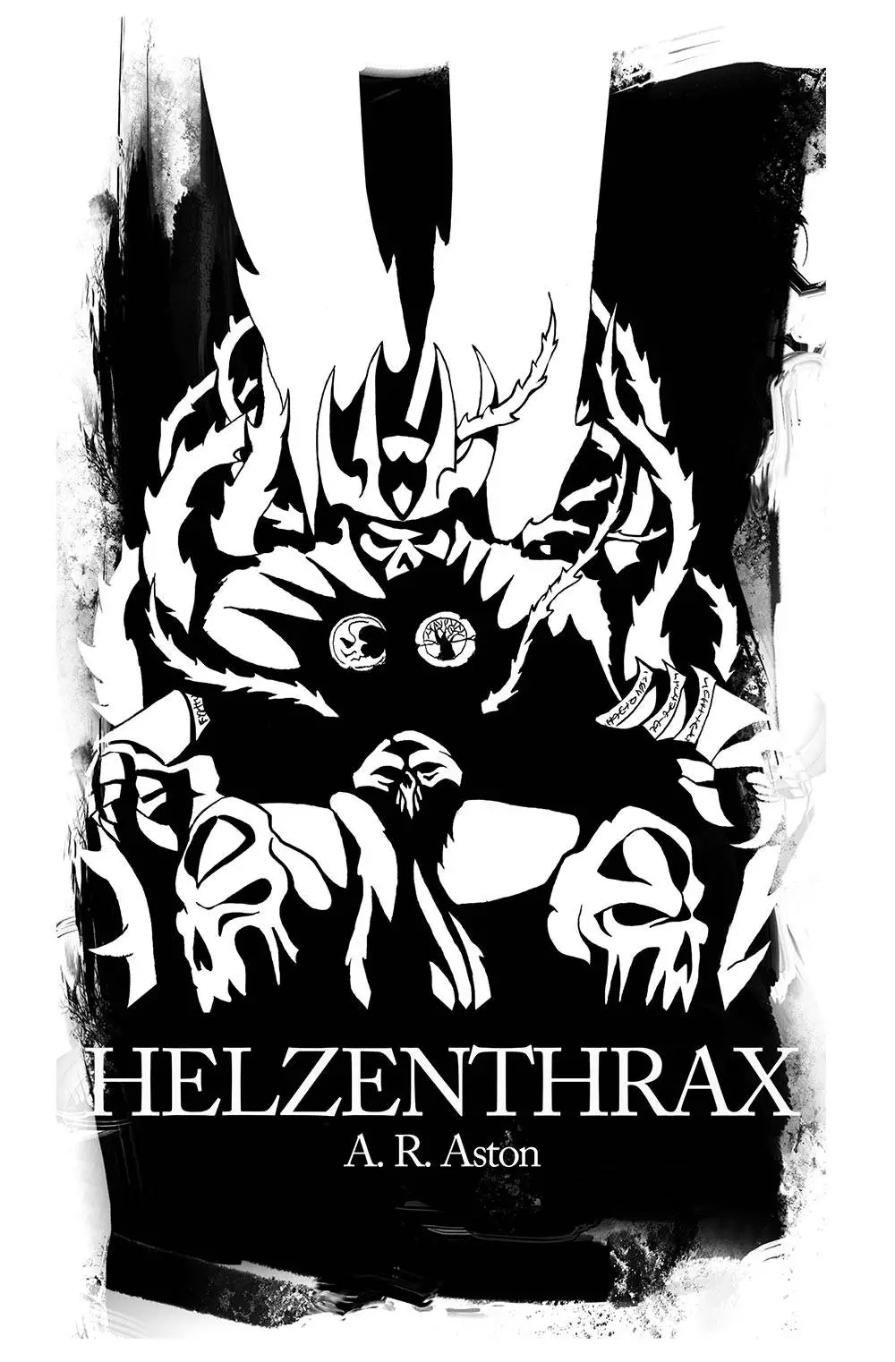
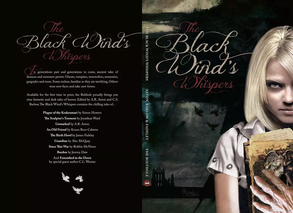
The Black Wind's Whispers
The Black Wind’s Whispers was the first anthology from the Bolthole, they entrusted me with the creation of a book cover. This was a collection of nine fantastic and dark tales of horror. A really good book that included a guest story from veteran writer C L Werner.
Would you like to commission a book cover?
It is a privilege to be chosen to bring someone’s precious vision to life. Get in touch and let’s talk about your project, I’ll do my best to help.

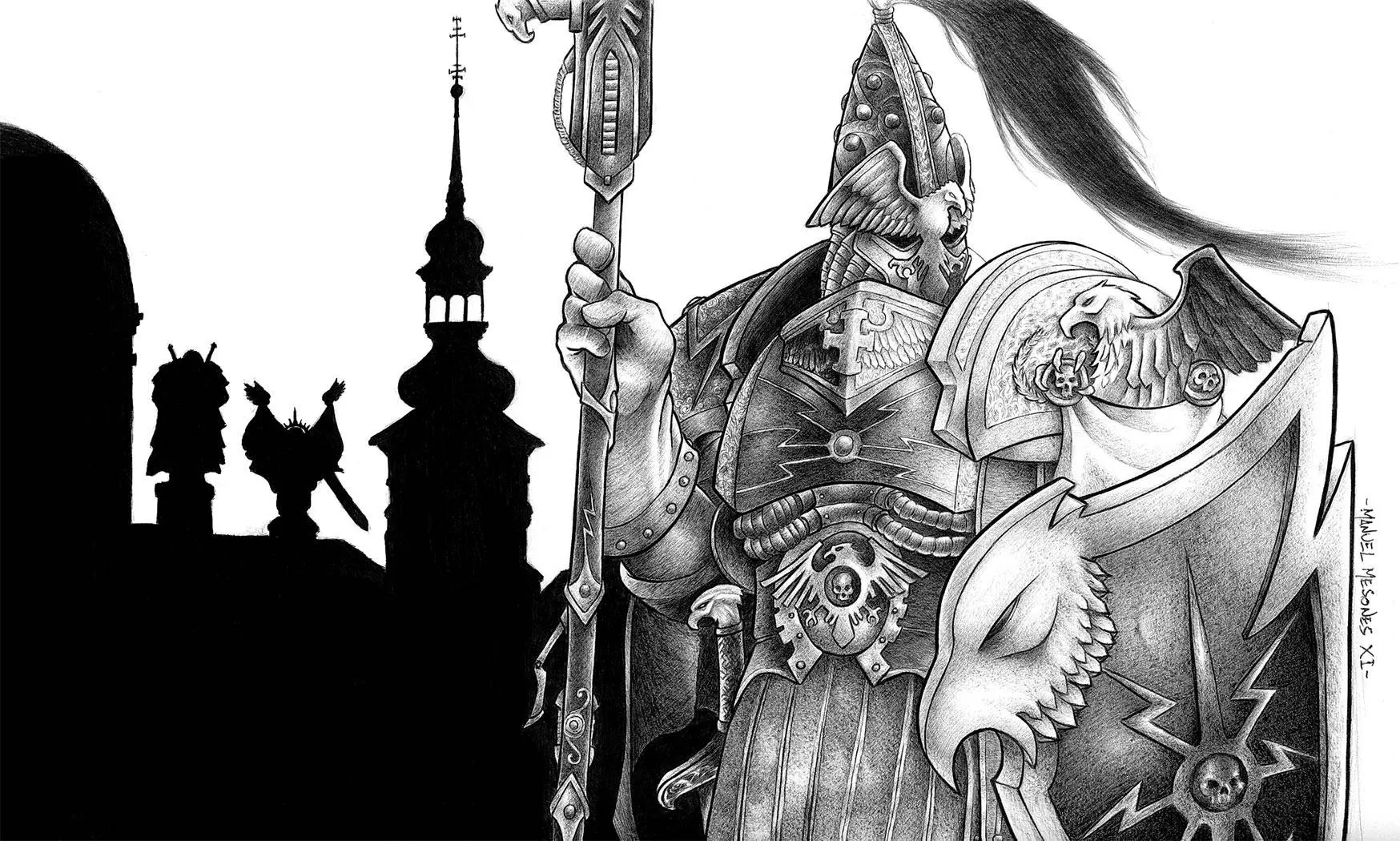
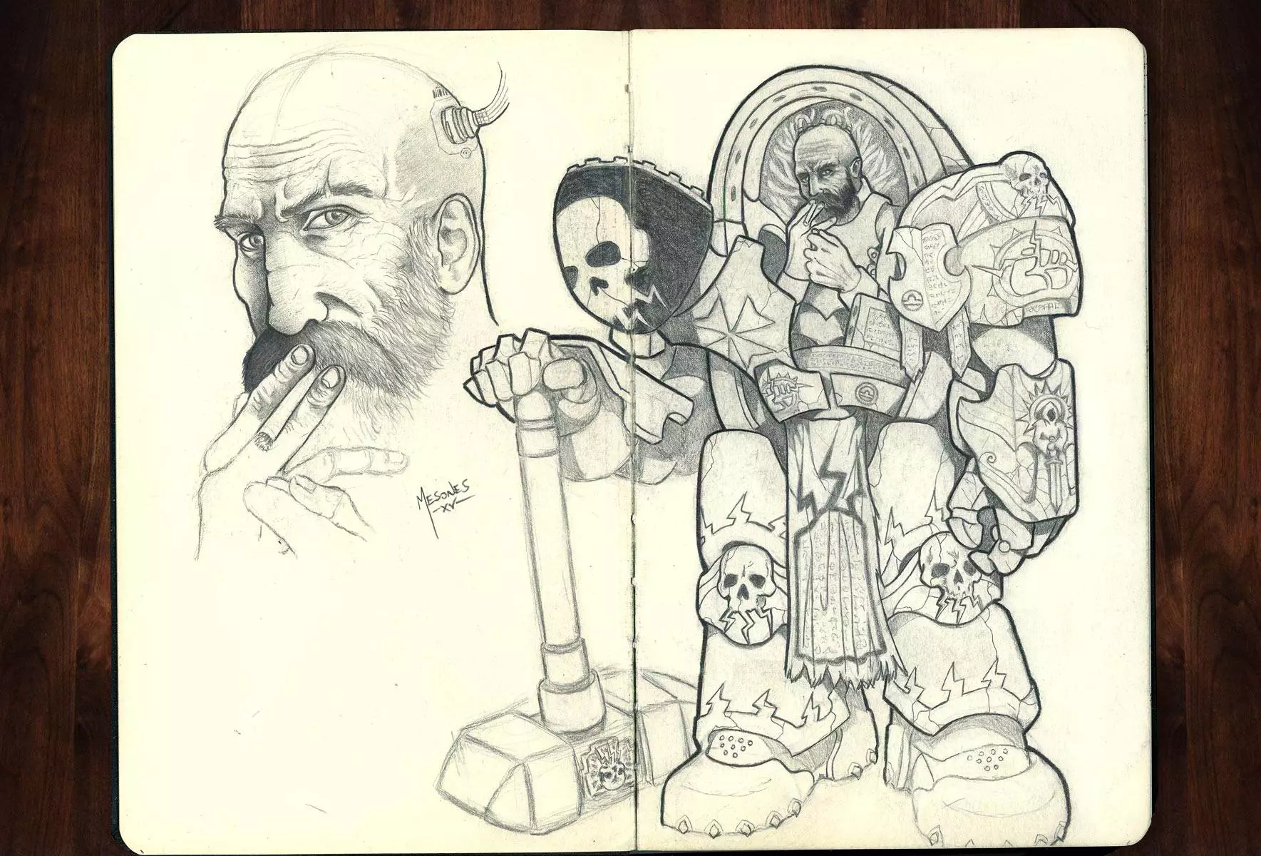
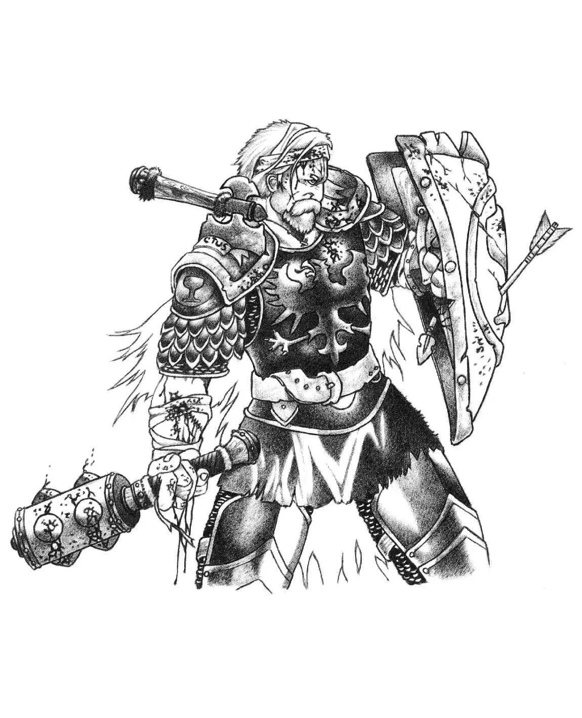
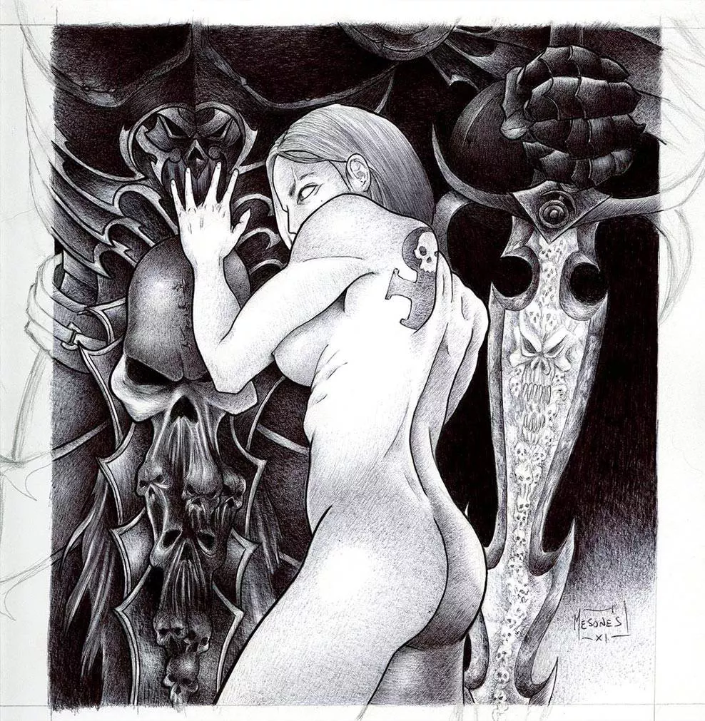
My Sketchbook
| Traditional Art |
My Sketchbook
I really enjoy working in a sketchbook.
There’s something grounding about putting pen to paper. Right now, I’m rotating between Moleskine, Leuchtturm1917, and the Stillman & Birn Zeta Series.
The Moleskine lays beautifully flat, which makes it a joy to sketch across spreads, though its pages can bleed a bit with heavier inks. The Zeta Series from Stillman & Birn, on the other hand, handles ink and gouache like a champ thanks to its thick paper—though it’s a bit less friendly for double-page work. The Leuchtturm1917 sits somewhere in the middle.
When it comes to markers, brand really matters—I’ve found Letraset tends to bleed less than Copics, though results can vary.
Below is a selection of recent sketches, experimenting with different tools and techniques across these sketchbooks.
Degenesis fanart | Graphite
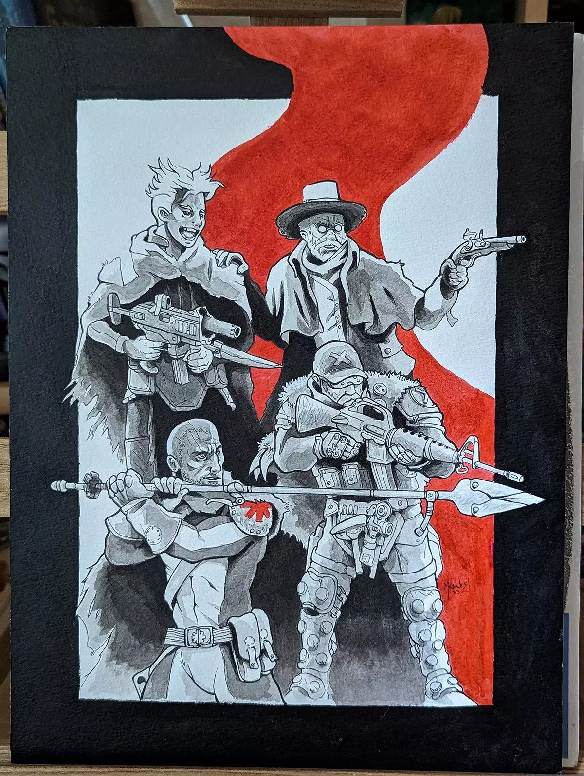
Degenesis fanart | Ink wash
Gulukh | Watercolour, ink & pencils
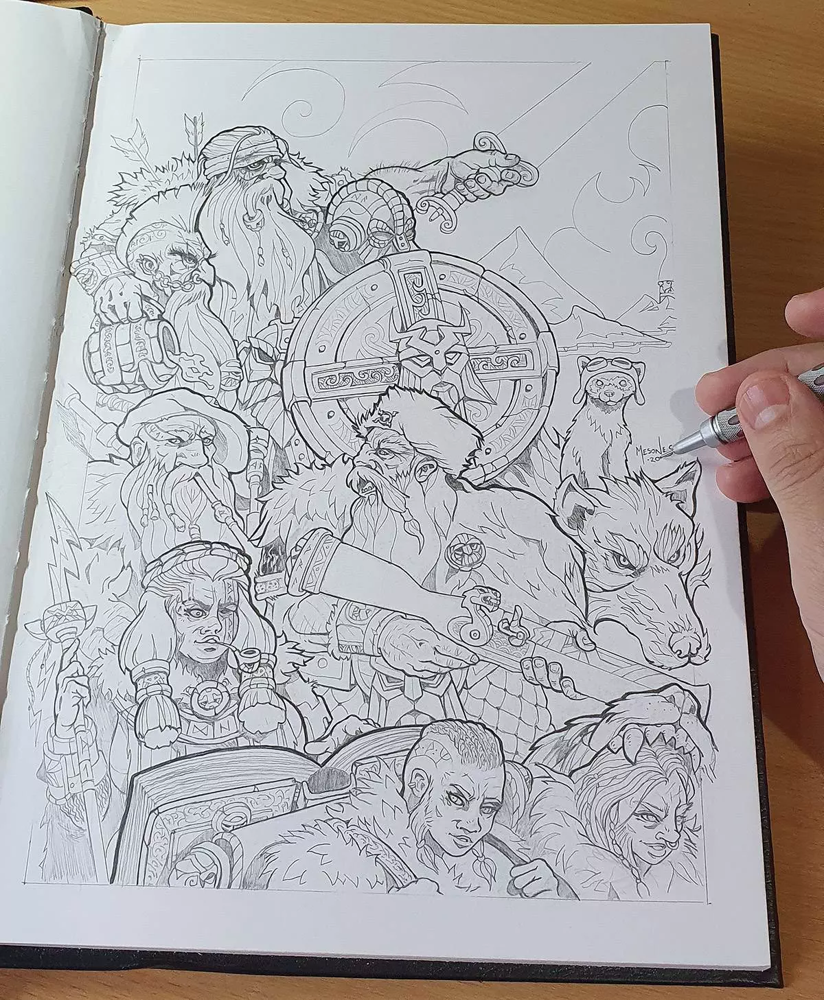
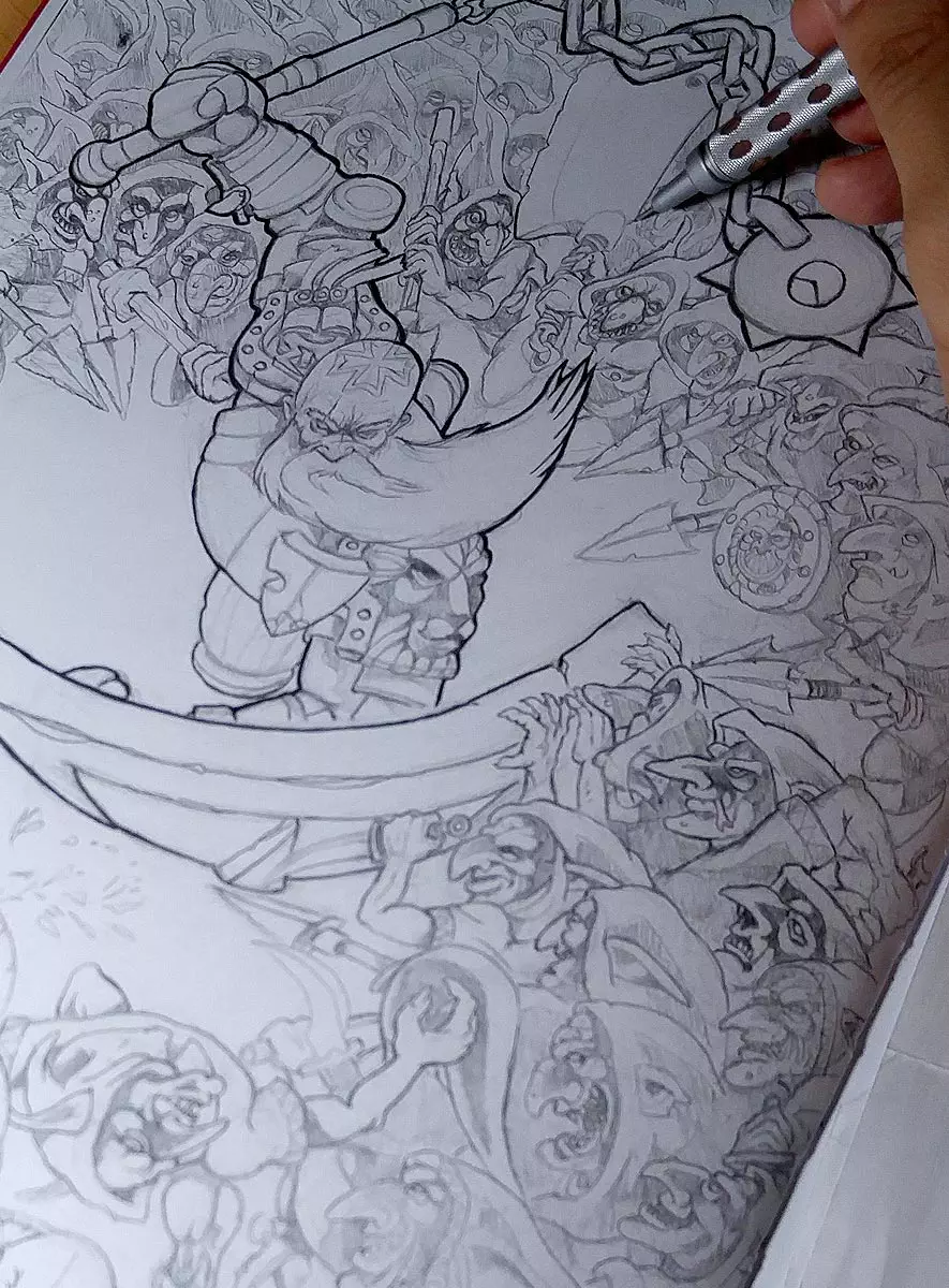
Dwarf March | Graphite
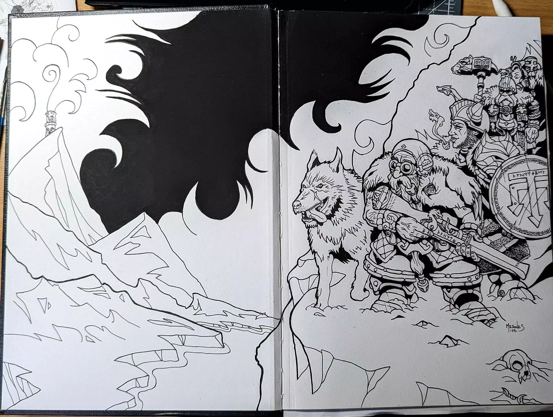
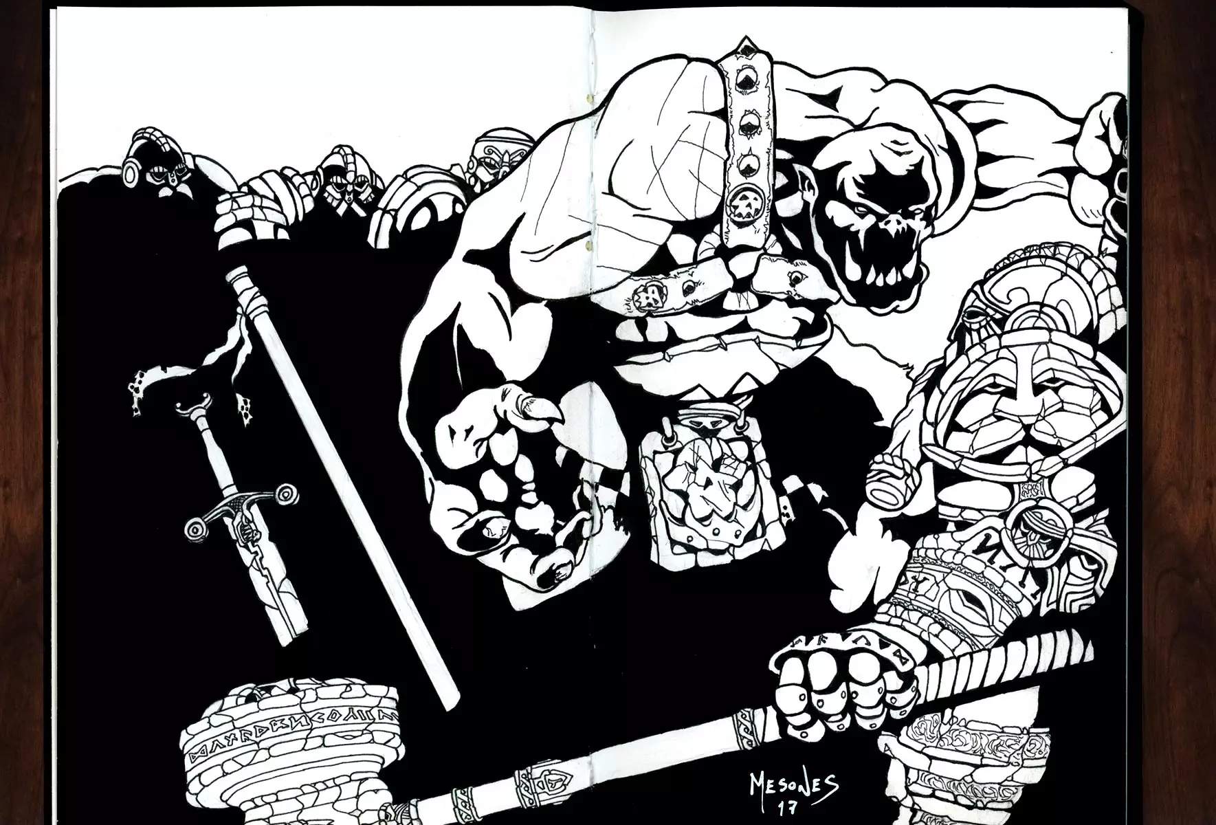
Dwarf Patrol | Ink
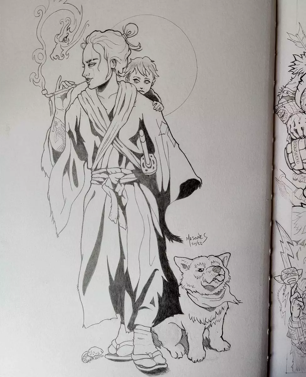
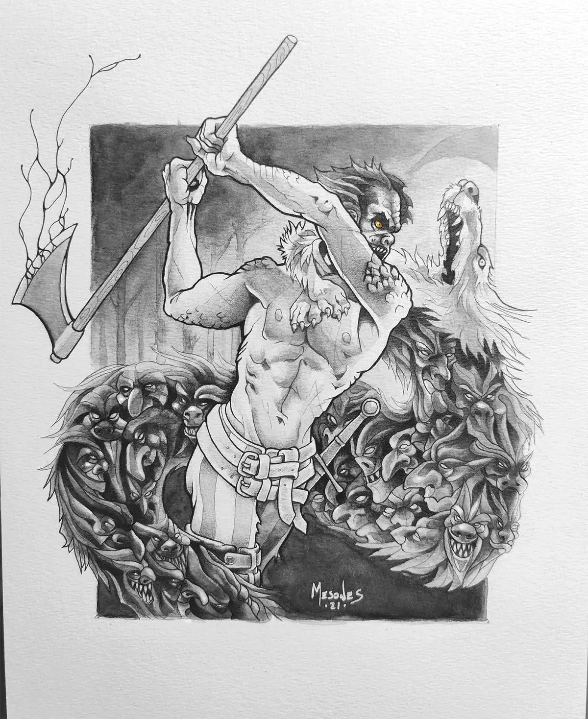
She-Wolf and Cub | Graphite
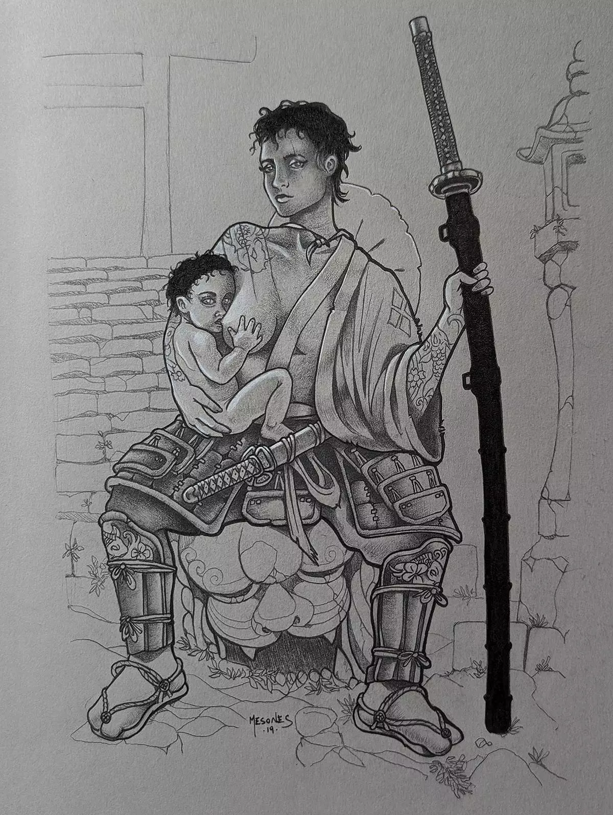
She-Wolf and Cub | Graphite on toned paper
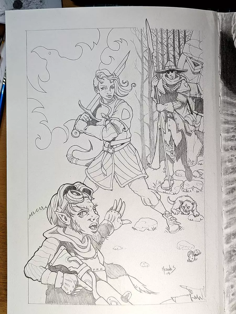
Young Adventurers | Graphite
Greentide | Graphite
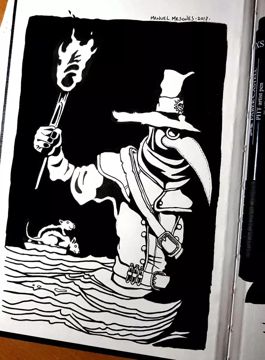
Plague Doctor | Ink
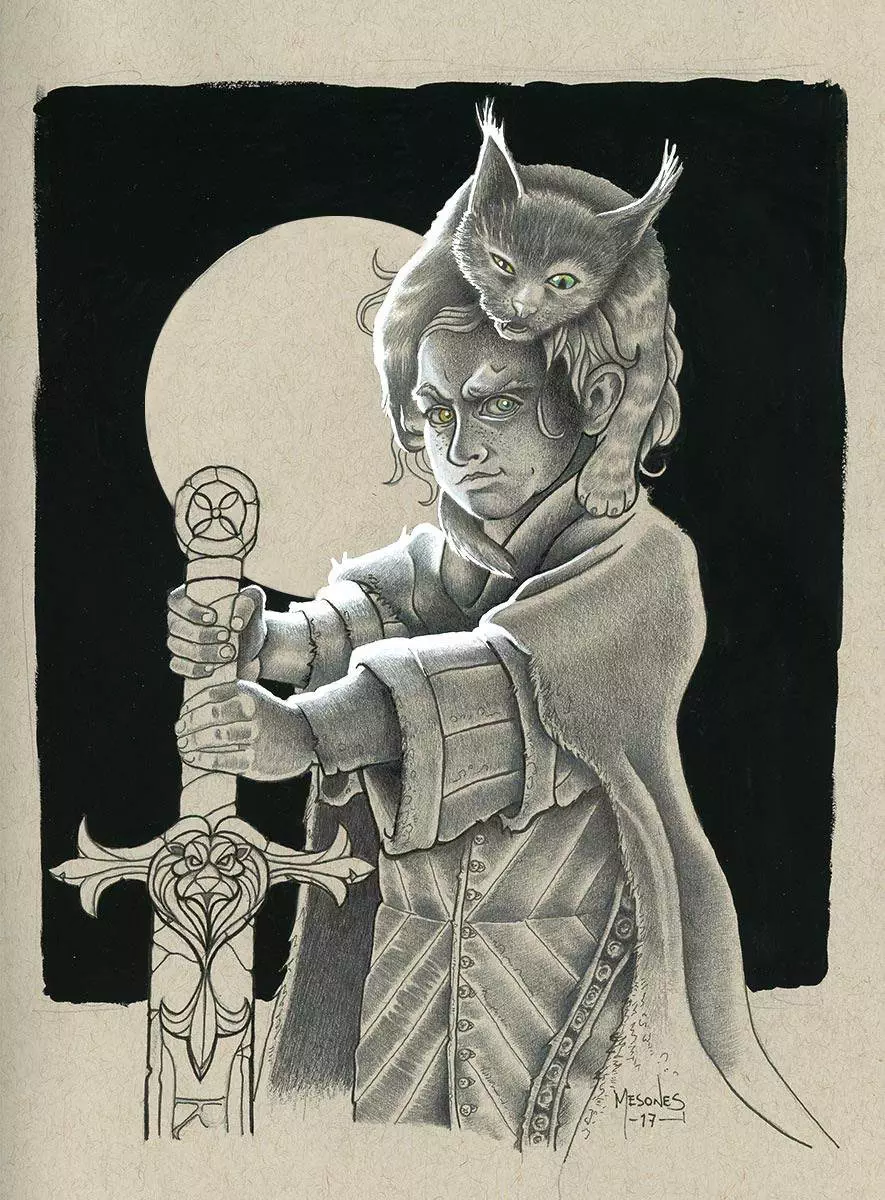
Squire and Mouser | Graphite and gouache on toned paper
Surrounded! | Ink
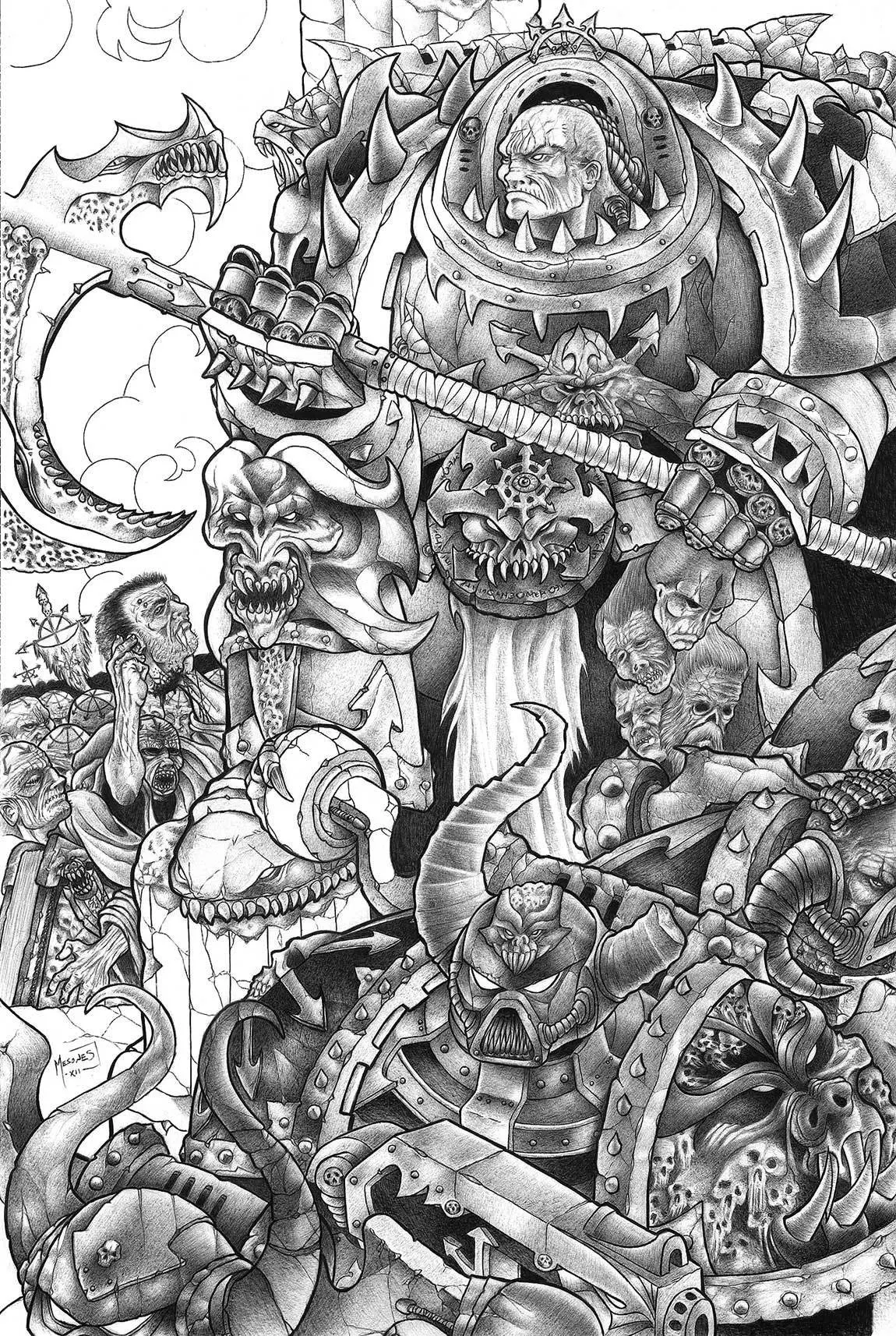
Chaos Undivided | Ballpoint pen
Adeptus Custodes | Ballpoint pen
Lunch Break | Graphite
Last Stand | Ballpoint pen
Sabathiel | Ballpoint pen
Would you like to commission a traditional illustration?
It is a privilege to be chosen to bring someone’s precious vision to life. Get in touch and let’s talk about your project, I’ll do my best to help.

Digital Illustration
| Featured Artwork |
Digital Illustration
Tablet & Software Workflow
I’ve really grown to love working with my Samsung Tab S10 Ultra paired with Clip Studio Paint—it’s completely replaced my old iPad Pro and Procreate setup. Since I’m no longer in the Apple ecosystem, the switch felt natural, and I haven’t looked back.
Clip Studio offers an incredible range of tools for sketching, inking, and painting, and the Tab S10 Ultra’s screen size and responsiveness make it a perfect match for professional illustration work. That said, I always bring pieces into Photoshop or Affinity for the final polish—refining edges, adjusting colour balance, or prepping for print. Each platform brings something valuable to the process.

Savage Oaths | Concept Art: Aethed
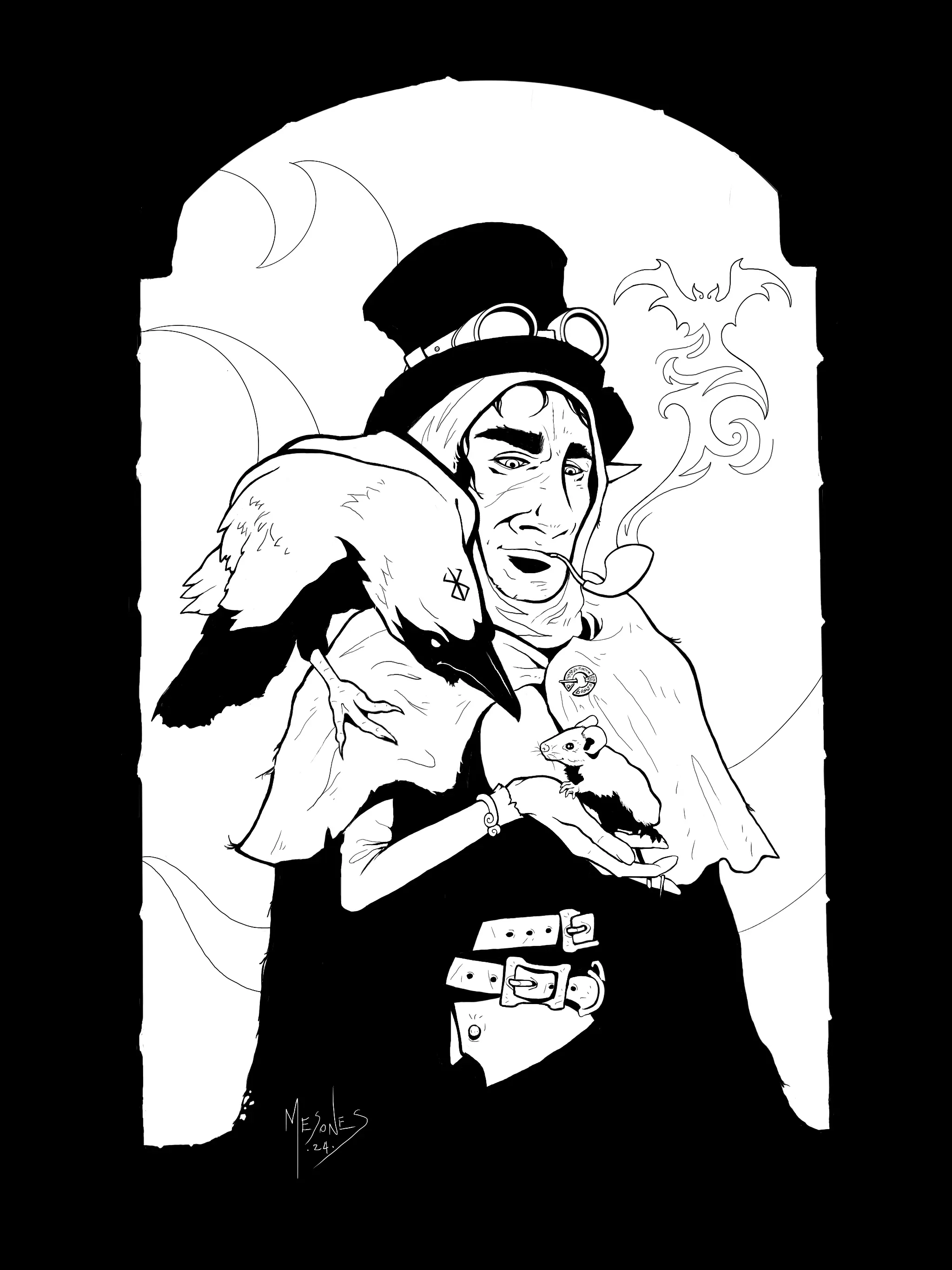
Personal Project | Frunkfinn, Ms Crawford and Mr Whiskers
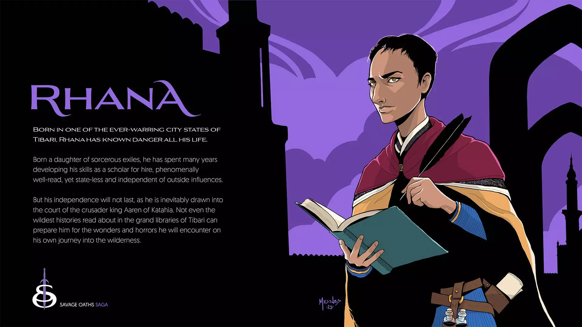
Savage Oaths | Banner: Rhana
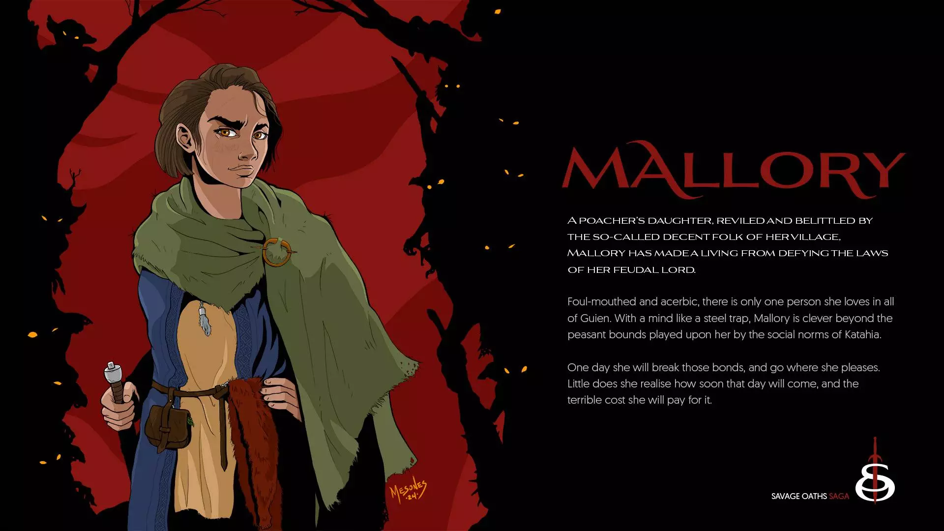
Savage Oaths | Banner: Mallory
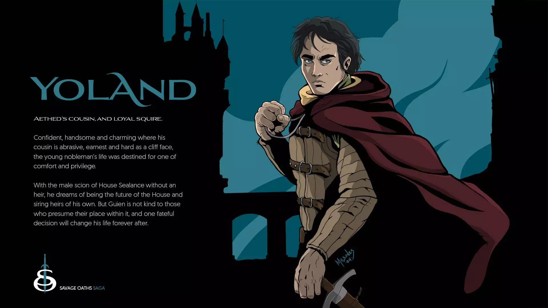
Savage Oaths | Banner: Yoland
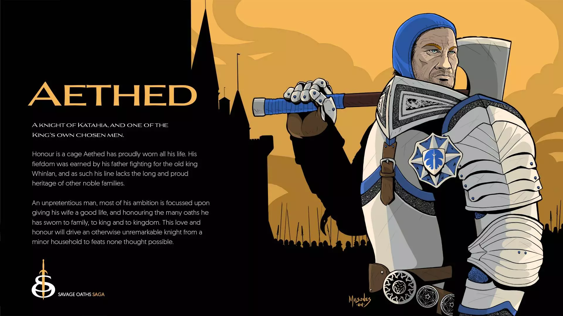
Savage Oaths | Banner: Aethed
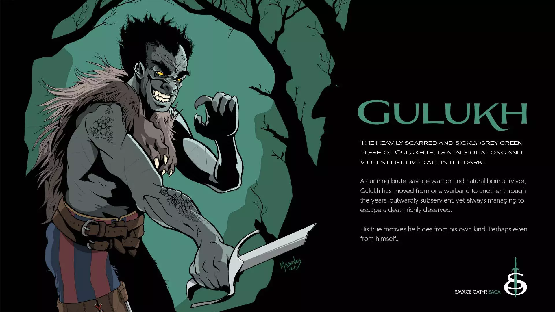
Savage Oaths | Banner: Gulukh
The Hobgoblin's Herald | Concept Art
The Hobgoblin's Herald | Concept Art

The Hobgoblin's Herald | Concept Art

The Hobgoblin's Herald | Concept Art
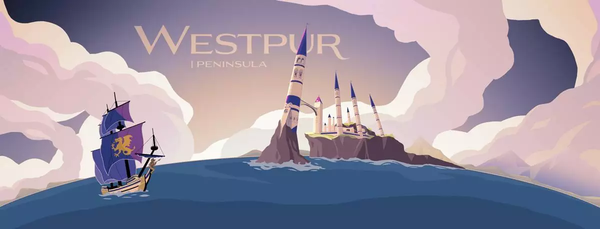
Savage Oaths | Westpur Peninsula
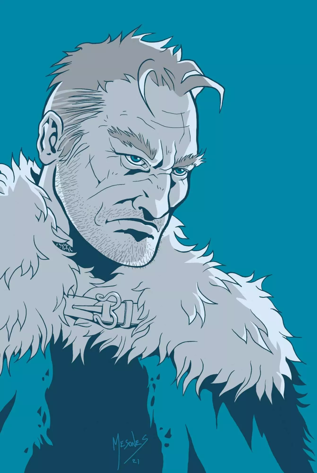
Savage Oaths | Concept Art: Aethed
Savage Oaths | Concept Art: Mallory
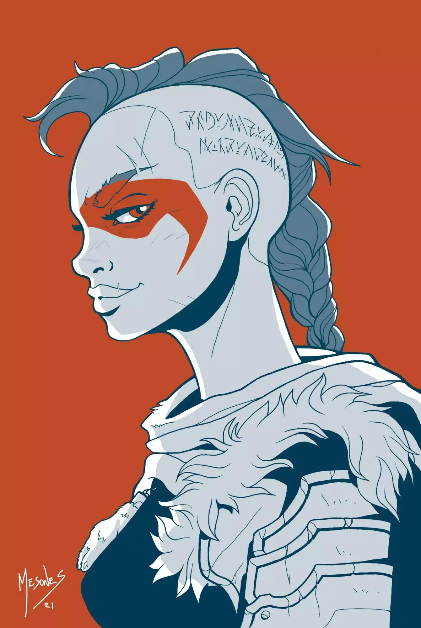
Savage Oaths | Concept Art: Rhana
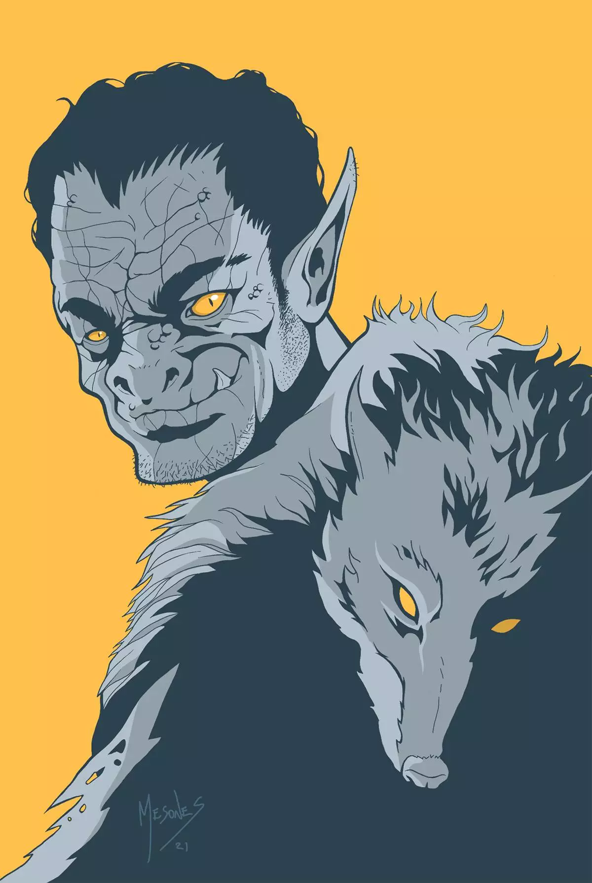
Savage Oaths | Concept Art: Gulukh
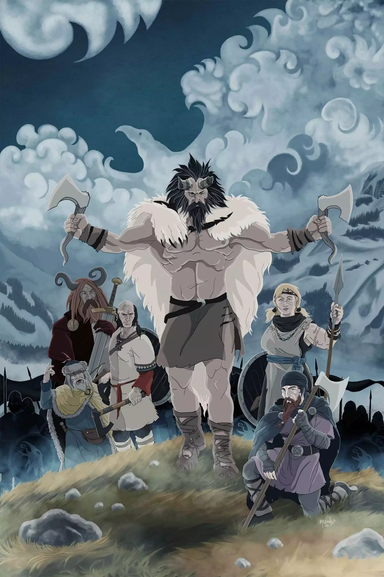
The Banner Saga | The Ravens, Fanart
Would you like to commission an illustration?
It is a privilege to be chosen to bring someone’s precious vision to life. Get in touch and let’s talk about your project, I’ll do my best to help.